
I realise all you 'new' keen Pearl and ASC students are keen to engage on this blog- and that there was a problem in accessing this blogspot. Blogspot have changed from Yahoo to Gmail sign ins- so it maybe that you'll all have to get a gmail account to engage.
For over an hour this morning I thought we'd lost the blog- it was there on the web- but simply not appearing as one of my blogs anywhere for me to alter details. Resolved the problem- but you'll need to let me know your new gmail addresses so I can make you administrators too.....
9 October 2010


1 June 2010
Amesty International Illustration Project - Anti-Rape Campaign
Well here the illustration project I had wanted to complete, and managed to now that my semester has ended.
While developing this Illustration I jumped through various concepts ( and causes for the campaign ) .. at some points I was deciding the cause based on how I wanted the Illustration to play out :P
When I had decided I wanted to do an anti rape campaign, I knew I wanted to look at the issue internally, rather than externally, and I wanted to look at it from the point of view of the rapist rather than the victim.
I thought about the tremendous guilt one would go through after committing such an act. I took inspiration from from an event known as 'The Black Hole of Calcutta'.
 The Black Hole of Calcutta was the guard room in the old Fort William, at Calcutta, India. Which was used to hold prisoners of war after the capture of the Fort on June 19, 1756.
Its an event known for it's horrific turnout, where eventually so many people were forced into the cramped room that 123 of the 146 British and Indian troops suffocated to death.
I had wanted the illustration to turn out quite unpleasant to look at, due to the nature of the cause I was
addressing. I drew the illustration style from my favorite renaissance artist Albrecht Dürer, and his work on the book of revelation.
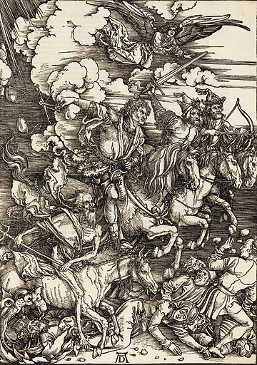


While developing this Illustration I jumped through various concepts ( and causes for the campaign ) .. at some points I was deciding the cause based on how I wanted the Illustration to play out :P
When I had decided I wanted to do an anti rape campaign, I knew I wanted to look at the issue internally, rather than externally, and I wanted to look at it from the point of view of the rapist rather than the victim.
I thought about the tremendous guilt one would go through after committing such an act. I took inspiration from from an event known as 'The Black Hole of Calcutta'.

Its an event known for it's horrific turnout, where eventually so many people were forced into the cramped room that 123 of the 146 British and Indian troops suffocated to death.
I had wanted the illustration to turn out quite unpleasant to look at, due to the nature of the cause I was
addressing. I drew the illustration style from my favorite renaissance artist Albrecht Dürer, and his work on the book of revelation.
After a series of very rough experiments of the illustration in Charcoal and black pen, (which have to be located in the black hole that was once my room) I had discussed with Mike, followed by Ramneek and Sumita ma'am once I returned.
I finally finished the illustration on photoshop with a graphic tablet, with texturing in the background from the original charcoal sketch.

The placement on the billboard

The bus stand Adshel


Hope I can get a lot of feedback on this..
Also I heard what happened with the passports, I hope the project can be saved and I hope that the exhibition on the 4th goes nicely either way.
7 February 2010
Initial Rumblings
Found Alphabet (Number 1) based on 'roman' language system now complete.
Alphabet (Number 2) now underway is a hybrid 'roman' alphabet based on Punjabi, Urdu and Hindi letterforms- all again from found typographic sources, this time from photographs taken during visits to India.
Alphabet (Number 2) now underway is a hybrid 'roman' alphabet based on Punjabi, Urdu and Hindi letterforms- all again from found typographic sources, this time from photographs taken during visits to India.


18 January 2010
Found Banners
 Quality of images is poor at large scale but wasn't planning on using these in my final design at the time of shooting.


6 January 2010
Typography for Sustainability Research
Happy New Year to Yin an' A' from snowed-in Broxburn, ten miles east of Edinburgh.
I'm now starting to get my head around my staff part of this project. You've seen the imovies... now for the Research Report.
Some of you have been brave enough to put your work up here for all to see... but many of you, disappointingly haven't.
As part of my research into Typography for Sustainability I need ALL of your font designs and the application of them to banners and posters to be included. I will also need the best of photographs of found typography which you have safely stored in your sketchbooks and on pen drives.
I'll be requesting soon that you send me all. In reality it is probably best that they are all stored in a central digital folder for me to collect (as collections will be too big to send via email). A good alternative would be to put ALL up here on the blog!
BE WARNED! I'm like a dog with a bone and won't stop until I get what I need from you. I'm very excited about discussing and showing all of your great works to the UKIERI Team through an academic research paper. Let's blind them with creativity!
I'm now starting to get my head around my staff part of this project. You've seen the imovies... now for the Research Report.
Some of you have been brave enough to put your work up here for all to see... but many of you, disappointingly haven't.
As part of my research into Typography for Sustainability I need ALL of your font designs and the application of them to banners and posters to be included. I will also need the best of photographs of found typography which you have safely stored in your sketchbooks and on pen drives.
I'll be requesting soon that you send me all. In reality it is probably best that they are all stored in a central digital folder for me to collect (as collections will be too big to send via email). A good alternative would be to put ALL up here on the blog!
BE WARNED! I'm like a dog with a bone and won't stop until I get what I need from you. I'm very excited about discussing and showing all of your great works to the UKIERI Team through an academic research paper. Let's blind them with creativity!
21 December 2009
Found Typography Exhibit Banners

The banners tell the story of the development of my font. How I picked it up from the streets, formalized it, and made it into strong graphic elements which can be used as a font. The same story is depicted in the poster too.


2 December 2009

FOUND TYPOGRAPHY
I am reposting this since I've heard it's not opening on a lot of computers.
FOUND TYPOGRAPHY


My inspiration for this project came from the bindi, a decorative piece worn by many women in India. Although they come in many ornate patterns and colours, the most common is a simple maroon dot on the woman’s forehead.
As I developed the concept I looked at the work of S.H. Raza a much celebrated Indian artist who primary subject is the bindu, using it as a symbol for a point or source of energy.
I took various elements from Mr Raza’s work as I began with the font, but the final font has arrived closer to how I saw the font than Mr Raza’s work, yet to pay homage the artist in have called my font BINDU.
S.H. Raza

Some of his work


Visual journal
Here are a few bits from my visual journal. I'll be uploading the rest in a few days. I doubt you'll be able to read my handwriting though.


29 November 2009
Great stuff!
I'm viewing some great work here... keep it up! Why not add more dialogue about the experiences you have had on your exchange-I'd love to know all about it.....and with photos too.
21 November 2009
Remix

I had got Gillian's illustration(BELOW). Using the same elements which were there in that illustration I created a new illustration depicting Global Warming.
The under construction building depicts a thermometer which is growing. The crane has a oil pipe which is helping the thermometer to build up. (Fossil fuel is one of the biggest contributors for the rise of global temperature ) . The bulldozer represents the green activists who are trying to destroy the building i.e to STOP GLOBAL WARMING.
The illustration technique also highlights the mechanization and the heavy industrialization of our environment.

.png)

20 November 2009

Found Typography


Hello everyone
Sorry for the late post.
Unlike the other students I chose to take an existing piece of typographic example and create a font out of it. The photograph I have selected is a common banner you see in the local juice shops of Delhi. These banners are made by local painters and have a strong vernacular taste. I wanted to formalize this into a strong, practical and useful font which can be easily read and used.
There are two variations of the font.Hope you like it.
Do write in your feedback.
Cheers
Hitesh
17 November 2009
FINAL DAY IN SCOTLAND!!!
Its been an incredible journey from our Pearl academy campus in New Delhi to the Adam Smith college campuses in glenrothes and kirkcaldy...
Our tutors and fellow students here have made it an experience of a life time.
It has helped us to get matured as designers ,hearing different views and ideas than our own.
one thing that has come out most from every thing we have experienced here personally is the helpfulness of the people and the passion for design.
a few things that i noticed and will remember ,while studying here ,were:
- exceptional typography from hoardings to visiting cards. (gone berserk clicking photos!)
- the greenery ...awesome landscape of this country.
- the detailing in everything possible.
i would like to thank everyone who has made this exchange to scotland possible , our faculty specially for their support.
p.s. i will be coming here again for sure!
Ankit
Subscribe to:
Posts (Atom)